Tuesday 29 November 2016

Tuesday 22 November 2016

Friday 18 November 2016

Tuesday 15 November 2016

Work in progress - Contents Page & Flatplan of Contents Page


Screen Shot 2017-01-02 at 18.24.12.png

I decided to start my magazine by producing the contents page first. I was not able to start off with my front cover yet, as i was not able to access the images I was going to use for that page. As I have completed a flatplan of my magazine, this made it easy to create this. So far i decided to have the text in a green colour and the background purple, as these two colours often go well with each other.

For improvements I need to insert more images and add more text.

Monday 14 November 2016

Location Photoshoot images

https://goo.gl/photos/nQT9YzvtkVALptxn9

Mock Front cover, Mock Contents, Mock DPS and draft on DPS Q&A


Journalism for DPS:
-      Structure – beginning – start with a blurb or introductuction question. , middle and end – 3rd person / conclusion question > linear narrative.
-      Lots of illustration / back story / real stars / media coverage – get creative.
-      Layout - size 10 – 12 font. – main body – same applies to contents page

Draft for DPS:


After weeks of, hundreds of entrees, we’ve finally cut it down to to people.             UK F U S I O N has now chosen the runner up - Abi - vee and winner of ‘Freestyle from the Youth’ - Layla.
Listen to Abi-vee and Layla’s freestyle on our website: www.ukfusionfreestyle.co.uk
Layla, a talented 17 year old sent us her freestyle based on her life after moving from Manchester to    London in able to pursue her career and succeed in music. Her freestyle was captivating, unforgettable and emotional as this includes her sacrifice on leaving her family and friends. Her amazing talent has made her win this month’s competition to gain publicity and for her music to be noticed finally.

Q&A –
What made you want to enter ‘Freestyle from the Youth’? – As last month’s winner of ‘Freestyle from the Youth’ got signed to a label after UK FUSION featured him in the magazine. I knew I had to send off my freestyle to help me get the break I’ve been waiting for. Even if I didn’t win, at least I tried, you know what I mean. 


How long have you been interested in having a career in the music industry?
 "I’ve loved music ever since I was young. R&B, hip hop, even a bit of soul sometimes. Only a few years ago, I decided to dedicate my life in music. Also a lot my family members and friends started to encourage me and made me release I was finally talented in something, at last! I started to write tracks and create mixtapes in my school music studio at lunch times as well. Even though I was missing out on school lunch, I really enjoyed putting together different sounds and beats with my raps." 

Who inspires you
“All sorts of artist’s – but if I had to pick one person in particular, it would probably by Stormzy. ‘Cuz like he’s gone proper big now, like worldwide! He’s putting Grime on the map. That’s how successful I want to become.”

What’s your music like? 
"Honest and close to my heart. Every word I say it real. This causes me to be so passionate about the music I create - because its my experience, that i hope others appreciate and listen to."

What does your family think of your sudden move to London
"At first my parents were unsure and were scared of me moving to a big city, all alone - now they see me being successful and the opportunities I’ve now have had – they are extremely proud and happy."  

Why Grime? 
“I have lots of brothers – so they played grime a lot which made me know a lot about it and made me love it.”

How important do you think it is for females to be noticed more within the Grime industry?
"I think it’s extremely important as its very male dominated – like by 80%. There is a small number of women that are within Grime but still they are not noticed enough. I loved to be able to be noticed as much as males do in Grime and to encourage other young females to be brave enough to go into Grime."

What was your reaction when you received the call that you won this competition?
"I couldn’t believe. Like I was in absolute shock that I actually won. Also, I was super excited – still excited, because by winning this competition is another step into my career. I just couldn’t believe – I still can’t believe it now."

How do you promote your music? Social media, YouTube, through friends?
 "yeah as my main audience are young, I promote my music through social media, as this is what people my age usually go on. So, this makes my music to be heard."


MOCK FRONT COVER:


MOCK CONTENTS PAGE:


MOCK DOUBLE PAGE SPREAD:

Location Photoshoot call sheet / recces and Studio Photoshoot call sheet


Thursday 10 November 2016

Magazine Proposal Pitch & Feedback

Feedback:
The feedback I received after presenting my magazine proposal to the class was that my magazine name - UK Fusion was suggested to take away the UK part. Originally I called my magazine UK Fusion because I wanted to include just UK artist in my magazine as my genre is Grime - A British genre. However, this meant limiting the range of artist I include within my magazine, as worldwide artist could be featured in my magazine as Grime is becoming more globally known. This could also jeopardise the distribution of my magazine to be only sold in the UK. As I want my magazine to gain access to people worldwide, I will change my magazine name to just Fusion.


Friday 4 November 2016

Photography Introduction


3 Point lighting:
  • There's a 3 point lighting. - this consists of three different lights placed around the backdrop. 
  • Sand bags are placed on the lights to keep the lights steady and stay in place. 
  • Models are suppose to stand 4 -5 feet away from the backdrop in order to not blend into the backdrop.
  • The further away the lights are placed the less bleached out the image is.
Backdrop: 
  • There are many different colour backdrops to choose from to have as a background for your image. 
Flashlights:
  • When the flashlight beeps, this means they are ready to be used. 
  • To brighten and dimmer the light, is placed at the back of the  flashlight. - from 1 - 6 
  • 1 is for the lowest amount of brightness - 3 is for mid brightness - 6 is for highest brightness. 
Soft boxes:
  • Soft boxes soften the light and defuses it to evenly distribute the light. - This also spread the light on the model. 
  • The soft boxes must be placed at a 45 degree angle. 
Fill Light:
  • This fills in shadow that again achieves a evenly distribution of light. 
Key Light: 
  • The key lighting is the main light which hits on side of the models faces- that then causes shadows onto the other side of their face.
Hairline light:
  • This makes light bounce on the back of the models head.
  • This then separates the model from the backdrop.  
Big circle: 
  • This is used as a reflector which then bounces light and creates a glow. 
  • The are no shadows on the nose, mouth, eyes etc. 
Camera: 
  • The type of camera used for taking pictures in the studio is Nikon D7100.
  • This has a 8 - 105 zooms lense. 
  • A LCD green light appear when the camera comes on.
  • To view photos, there's a play button - which can also show the image zoomed in, to show more detail. 
  • WB means wide balance - which brings out natural colour. 
  • ISO means the film speed which makes the light higher, so more light is coming through the lense. 
  • RAW means a higher quality of the images - more then a JPEG.
  • By pressing the menu button then a green camera, displays setting control - You can then choose to have your image come out as -  natural, vivid, colour or black and white. 
  • When using the camera, if you shoot in a portrait modem this achieves at a angle that is best suited for a A4 front cover. 
  • When using the camera, put the lense in the palm of your hand - to achieve more control when zooming in and out. 
Aperture Option: 
  • This achieves a depth of field, which is used to focus on two or more people in the frame. 
  • To shallows the depth of field, choose through the number settings. 
  • Turning on the left shallows the depth of field.
  • Turning on the right increases the depth of field.
Sutter Option:
  • This feature is used to capture movement in a picture. 
  • On the settings, left lowers / slows down the shutter - so image comes out blurry. 
  • Right increases/ makes the shutter faster which then focuses more on the moving image.


Thursday 20 October 2016

What I learnt on Illastrator:


- I first learnt on the Illustrator software to colour in the lettering and the outline of the lettering.
-I then learned how to make a shape on top and bottom of the mask head.
- I then by highlighting a word, it would make the gaps of the letter be filled in.
- To place a background into the page and then to send the image to the back, so the image is behind the text, so the text is still visible.
- My favourite part that i learnt through Illustrator is to make the background design but into the lettering.
- This software is very intressting and i am looking forward to using this again to achieve a professional neat looking maskhead.

College Magazine Evaluation

Evaluation on my College Magazine


I created my front using the software Photoshop and my content page on InDesign. These softwares helped me to develop skills and knowledge on what is needed to include within a magazine that'll help me in the future. What I think was a success for my college magazine is my masthead. I arranged my masthead behind my covers head, as this is a technique is used a lot by magazine. I also didn't want my masthead to cover my cover star, as I want my cover star to stand out as much as possible. Also the colour scheme I choose was blue and red. I picked these colours because as my magazine is based on my sixth — form - LSC, which is the colours that the college uses. I thought this made my front cover look neat and the theme continuing throughout my two pages. The image I took of my model, Numa on my contents page writing on paper. This connotes the 'hard working student' I wish to portray in my magazine. My front cover image is also a medium close up, with my cover star giving direct eye contact to the camera. This makes looks as though she look right at the audience.
Some feedback I received by some of my peers were:


Next time I make a magazine I should arrange my contents page in less of a list arrangement,  as I think this made my content page look boring and lacked originality and creativity. I could have also made my cover lines stand out more, as the size and style of the font I used did not achieve the look I wish to give off. I had a puff displayed on the front that again didn't stand out on the page. I kept my background of my contents page plain as I wasn't sure on the colour of background I should use that would go well with my page. It was mentioned by Ebony and Karolina that the background I used for my front cover is distracting and could have looked better if it was on a black background instead. Next time, I will choose the background I use wisely that will suit my magazine and the colour scheme I use. I will also Include next time, more images on my contents page that would show a variety of people within my magazine instead of my magazine focusing only on one person.
To conclude, for my music magazine I will take the feedback I received from my college magazine to help with creating my music magazine. Overall I have done well for my first attempt in making a magazine as the skills I've learnt so far will definitely help.


Tuesday 18 October 2016

Magazine Newsstand / RWD magazine distribution


I went to see how the music magazine are displayed at WHSmiths in Stratford Westfield. All the magazines are layered in rows. They all have different colour schems and stand out in their own way. The cover stars shown for the front cover of these magazines are seen to be mostly male - white males. I noticed that the rock genre music is shown at the front of the display. This shows the front cover of each magazine. As for the other music magazines, they were displayed behind the rock magazines. This makes those magazines not fully visable - only the maskheads is fully visable. The cover lines are also not visable. These magazines are not as noticable as the three at the front. However, they are still noticable from their bold maskheads. For example, ‘DJ’ is shown in big red font. On the other hand, if a magazine isn’t as known, their maskhead being the only thing visable wouldn’t help them receive publicity. But for magazines like Mixmag, they are a well established magazine so still have a high chance of getting bought even though the magazine isn’t clearly shown.


RWD is a UK youth lifestyle and music magazine. RWD focusses mostly on Grime and Rap music of artist from the UK and US.


Do they offer subscription?
Yes they do, by entering you email when going on to their website, there is a section to enter your email in. This would then entitle for you to get messages from RWD on new issues etc. Keeps you updated on the magazine.
RWD has links to social media links – Facebook, Twitter, Instagram, YouTube etc. – This allows the target audience RWD is reaching out to, to be more likely more known – as social media is a common tool used by young people.
Does RWD offer E - zines?
Yes which is displayed on RWD's website, to be viewed online and downloaded. This is a free tool to use to read RWD and includes similar content which paper magazine would have to offer.

RWD is a digital magazine and paper copy magazine available in certain stores/ areas. The content within the digital mag is similar content to what would be in the paper copy magazine. As the genre of music is mainly rap and Grime music, the audience aim at this music - teenagers and young adult, don't seem to mostly buy magazine. As
RWD can be accessed online, this makes it easier/ more likely for them to get their targeted readers for their magazine.
The website that views RWD’s digital magazine has features displayed - Music videos, blogs, sports section, new movies and overall news. This is features that are also include in the paper copy of the magazine but gone into more detail on the website.


RWD Distribution:
RWD distributes their magazine to a range of distributors in the UK. This achieves a wide range of audiences to be able to have access to the magazine and for RWD to become more known across the UK, to a variety of people.


Monday 17 October 2016

Starting my proposal

-This is my starting point to my magazine proposal.- I would have to include some images of the types of artist my magazine will include. - In each section i need to state more reasons for why i choose what I chose and how i came about that decision.-I will also have to include a flat plan on what each page of my magazine will potentially include.- I will also need to create a prezi powerpoint to present this information.


Magazine Proposal

Title of your publication: U K F U S I O N 

Chosen musical genre/genres:
-        Grime

Content you’ll include:
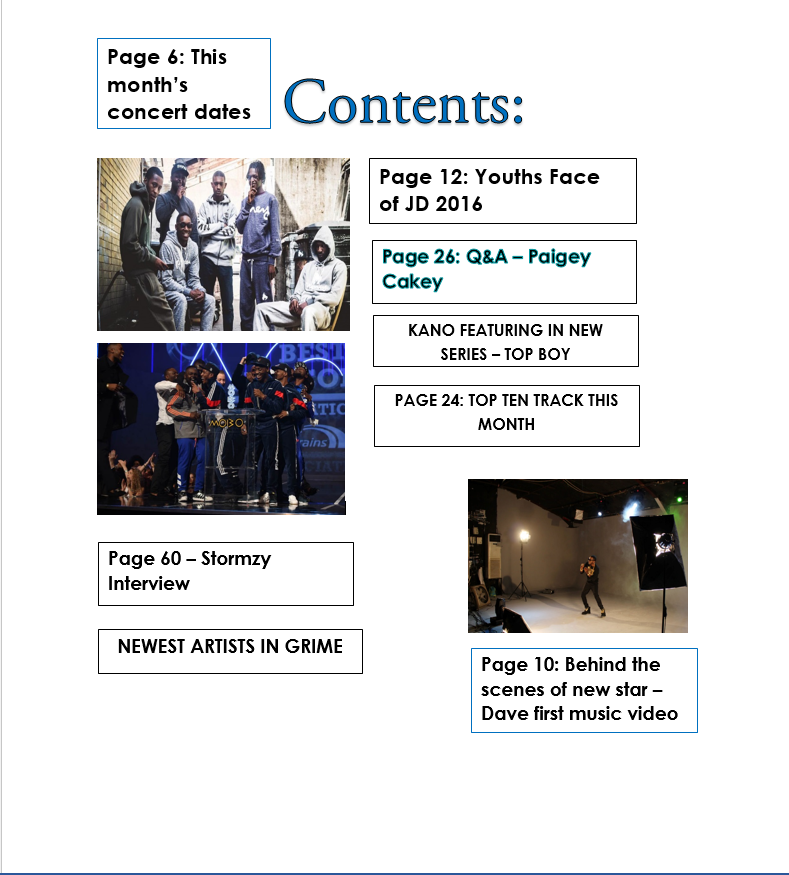
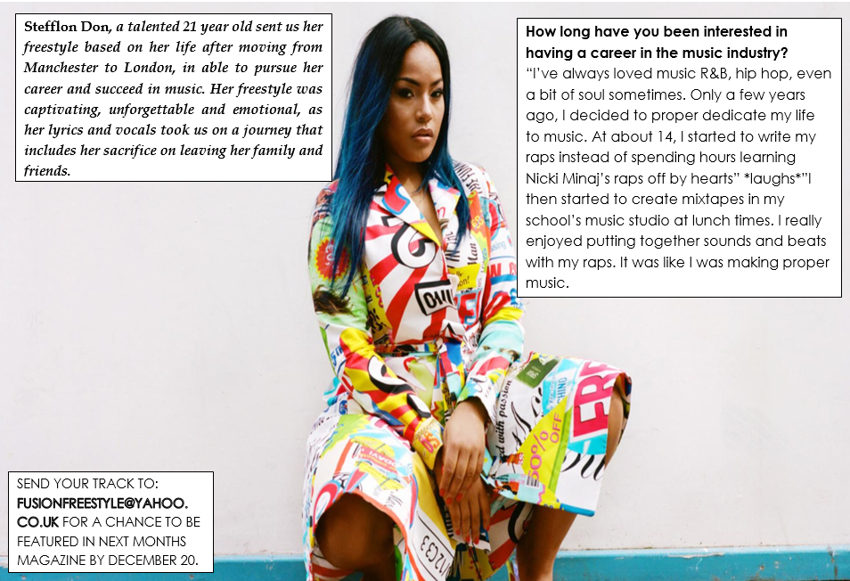
-         Types of artists – Skepta (Boy Better Know), Stormzy, Section Boyz, Drake, Paigey Cakey, Lady Leshuur.
-         Regular items - Interviews of artists Q&A, making of music videos (behind the scenes), new music.
-         What makes magazine different – that the magazine mostly centres on the grime music genre – there’s isn’t a grime magazine available at the moment. – It’s focusses mostly on British artists – males and females in the Grime music industry.

      Design layout:
-         Mostly dark colours like black, red and maybe yellow as potential colour schemes throughout the magazine and for the front cover.
-         A mask head for the title of my magazine – abbreviated as letters – so it’s easy to remember the name of the magazine. – Or a one word simple name for the magazine.
-         Cover lines on both sides – brief
-         Cover stars/ stars centred in the middle – mask head placed slightly behind the stars.
Who might publish my magazine?
-         Any publisher could publish my magazine as it based on a genre – grime which is not created into a magazine yet.  – However, Grime is slightly similar to rap music, so a publisher may not want to publish another magazine that is similar to a magazine they already have.

Who are the targeted audience?

-         Young people – male and female aged 17 – 24 years old. 

Monday 3 October 2016

Practise Exersise on Front Cover - Photoshop

- I learnt through the photoshop software is how to arrange images and text.
- I also learnt how to organise cover lines and maskhead to make this look like a professional front cover magazine.
- By holding the alt key, this makes the image become bigger so spreads out on the page without making the image change.

Saturday 1 October 2016

VIBE magazine - Media Kit 2013


This shows the type of audiences that buy and read VIBE magazine in 2013 - this makes it able for people to view the majority and minority of the attention VIBE magazine gets. This would also make it easy for editors of VIBE magazine know exactly who their targeted audience are, to then use that information to edit and make their magazines.  


- As you can see, just over half of VIBE audience consists of males and 75% of the audiences are black females or males.  - 82% of the reader VIBE gets are also people aged 21+. - The way VIBE magazine is shown, would have to appeal to young adults/ adults.- so the sales of their magazine continues to increase
- The image shown above implies the party atmosphere and emphasise on the music and concert VIBE magazine focusses on.


XXL Magazine - Media Kit 2012

- These statistics show who XXL's majority and minority readers are.
- This information would help for the editors of XXL to create their magazine in a way which appeals to their targeted audience.
- 83% of the age range of XXL reader are 21 yrs +
- From these statistics it's clear that majority of the readers of XXL based in 2012 are black people (African American). The images of numerous XXL magazine issues also show black artist as the cover stars.
- Males are also the main audience XXL received in 2012 - majority of male artist are also shown as the cover star. 
- A s XXL is a rap genre magazine, this genre is very dominated by males and it's shown clearly through the amount of males to female on the front covers. - Only one female is shown as a front cover - Nicki Minaj. 


Friday 30 September 2016

College Magazine Flat Plan


Textual Analysis of a College Magazine - Front Cover

Image result for college magazine


-The cover star of this College magazine front cover displays a student - who looks happy and is shown holding book - this shows that this student is studious and is a good pupil - this gives the college this magazine is talking about a good name and positivity.
- As the cover star is covering the maskhead, the maskhead can still be understand by the reader on what is says - College Lifestyle.
- The cover line which says the cover stars name is slightly larger in font so we know who this cover star is and what is mentioned about him in the magazine.
- The colour scheme of this front cover goes well with the image and the text - as the colours are not to bright. - yellow and white.
- The cover lines are short catchy phrases / words that catches a readers eye straight away - this would then encourage a reader to get this magazine to read on about the information in the magazine.
- A barcode is displayed on the bottom left hand side implies that this magazine can be bought.
- Displayed on both sides of the magazine is a range of cover lines - this shows that this magazine covers a lot of information to keep a reader engaged and entertained.    

Textual Analysis of Two Magazines - Content Page - XXL and VIBE


VIBE

- The way 'contents' is displayed makes this page and magazines unique, shows the individuality VIBE is compared to other magazines. — With 'contents' been printed in white, works well with the red background.
- In the top right hand corner, there is a date underneath the magazines title — showing the date this magazine was published.
-  The artist is placed in the middle of the page to be able to stand out — he stands out by him also being topless - his tattoos are visible and wearing a lot of bright jewellery. - this also shows the fashionable elements VIBE magazine may contain. - These's elements also attracts the attention of young people. - this also implies the genre of music VIBE is focussing on - hip-hop/rap.
- The red background also shows a capital V is promoting VIBE magazine and so a reader can recognise the VIBE logo.
- The sections underneath the features headline is in fancy font - this makes the magazine classy and sophisticated.
   

XXL

-XXL's content page always goes over to pages - They are separated by titled - 'The A-Side' and 'The B- Side. 
-'The A-Side' content page displays the artists who were the cover stars on the front cover. The image is a high angle and they are dressed in mostly white - like they were dressed on the front cover. 
- On the bottom of the page - bellow the image - shows the features that that the magazine will contain. - Most of the features are of individual article from people. 
- This section is shown numbered in chronological order - so it is easy for a reader to find the individual article in the magazine. 
- 'The B-side' content page shows a young female, dressed quite revealingly - this image could have been purpose put in the magazine to attract XXL's male viewers.
- The colours used on this page is quite dark and contrast with the previous contents page.
- This contents page has a heading called 'departments' and is again showing article which the magazine contains in numbered chronological order.